Last night I cleared (almost) everything out of my studio - so that I could focus on the installation in terms of it's 'total space':
By 'total space' I mean the space around the work, which viewers experience just as much as the work itself - in installations this space is part of the work and cannot be separated.
In this post I'll describe some of the dimensions I am considering when looking at this space, in the context of the work I'm currently developing.
The original 'installations'
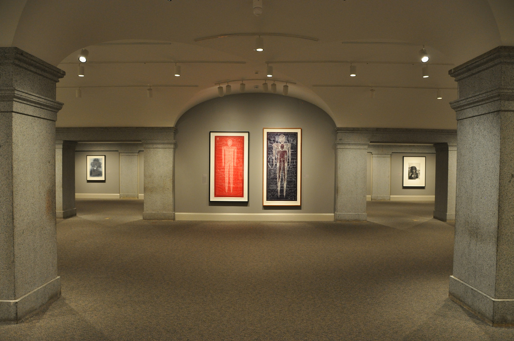
Installation art got it's name because curators used to have to decide how to hang paintings and place sculptures. This was termed 'installation', and photographs for publication of several works together were called 'installation shots'.

For installation artists much, if not all, of that process of arrangement of objects in space has become an essential aspect of the artwork itself. Each work cannot exist in isolation but has to be considered in terms of it's relationship to the space in which it is installed.
So in practice, the work must be 'site-specific', or somehow transposable to more than one location.
Using the architecture
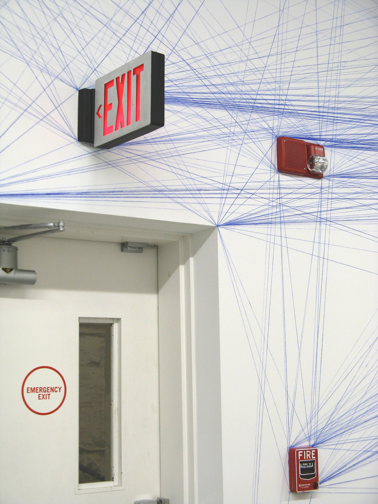
An interesting antecedent for 'transposable' work is Sol Lewitt. A few weeks ago at Mass MOCA I saw the work 'Wall Drawing 51: All architectural points connected by straight lines'.
As the title suggests, this work can be recreated in any location (as long as it has some architectural points).

As with much of LeWitt's work, the art is in the crafting of sets of repeatable instructions. Those instructions can then be carried out again and again to produce physical instantiations of the work.
This is one way of making the work mutable, but it also carries a rigid inflexibility that constrains the piece and prevents it seeping beyond a defined boundary; the work cannot 'mutate' beyond the prescription of the instructions.
Much more common is the approach that the artist must be physically present to carry out or oversee the instantiation of the installation. The consideration then is how the work can mutate to converse with new surroundings in a way that compliments, augments or challenges it's origin.
Navigating the space
There are a number of transposable elements I am currently considering in how I present my work. Each will have to be reconsidered in each location it is installed, and it is worth noting a few of them here.
Firstly, what is the viewer's initial experience on entering the space?
Beyond that, what path(s) can viewers walk through to enter the space and approach the work? Which are more traveled, and why? What aspects of the work are accentuated by particular routes? Which routes encourage temporal or physical interaction with the piece, and which don't?
The routes viewers can take will have a big impact on how people respond to the installation. A 'throwaway comment' type of an installation might call for fast and casual footfall, but for my work which requires some time I am experimenting with ways of allowing passage through, while also creating a pool of space which is separate from the traffic, in which time can be spent and immersion can occur, without prescription that it must occur.
Divisions within the space
What distance do you want viewers to have from the work? Do you want people to walk through and explore, or is the work to be physically cut off, distant, or somehow different from the viewing space they occupy?
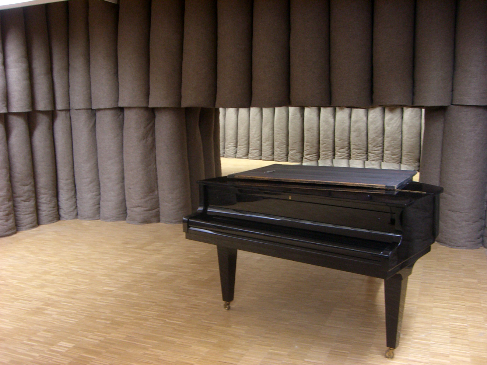
There is a work by Jospeh Beuys on permanent installation at Centre Pompidou in Paris, "Plight", which was very influential on me. One of the key aspects of the room, when we step back and stop thinking about the silence, the felt, and the presence of the room, is that you can't enter the space.

A rail prevents your entry, and also delineates a small viewing platform. This gives the space a sense of otherness, and timelessness. In this context, the rail is part of what gives the installation it's gravity, it's immanence, it's sense of potential.
The frame
And for all the talk about the democratization of space, about how installation takes away the centred viewer, there is always still a frame within which your work will be considered.
This might be an institutional frame, and therefore conceptual. But even physically, there is a frame provided by the walls, by markings on the floor, by the use of light, by ropes, gates or rails. And if there isn't a frame already, you have the option of introducing one. As in "Plight" this frame can serve as a boundary, or the frame can be just a suggestion.
In many room-sized installations there is no physical frame - this means that the work is fully immersive and is a deliberate move on the artist's part to obscure the frame so that viewers are not aware it. In these cases the work can still be framed by the physical features of the room, and particularly by the transitional nature of the entranceway provided to enter the space.
In any case, the concept of a frame is something which you can work with or against.
Emphasis and de-emphasis
What elements of the space are the ones that viewers can't see?
In the work I am creating at the moment, I want to draw back the sense that technology is central in the work. So I am experimenting with techniques for placing the projector I am using to craft the light out of view. This is not to attempt to obscure the fact that a projector is the medium by whch the light is being crafted, but rather to de-emphasise the role the projector plays and emphasise instead the light on it's own terms.
Indoor not outdoor
Since arriving here at CAC I have been increasingly focused on the installation potential for this project rather than outdoor. It's odd, because the project began with such an outdoor focus.
There were a whole set of issues related to working outdoors; technology, projectors, and sound equipment, and it was forcing me down a road of 'one-off' performances or interventions. Those elements are not crucial for this particular work at it's current stage, and so they have been sidelined.
There is still strong outdoor potential for this work, more so than my previous projects. However at this stage, quickfire experimentation took priority, and indoor rocks became both a pragmatic reality and a potent ground for exploration.
The conceptual grounding which was so engaging at the start, could be brought indoors and more easily experimented with. The oldness and brutality embedded in the broken-open shape and texture of rocks. The internal, perceptive world that we conjure up and it's relationship to the alien and disembodied.
These are ideas that I want to exploit in the studio, and if and when the time is right, to explore in an outdoor arena. Outdoors brings it's own set of potentials and challenges, but which I think need to be prepared for in the studio, and should be respected for inherent caveats.