Last Friday I attended a Data Visualization seminar by the Responsible Data Forum. I got a fascinatingly succinct introduction to the concerns of applying data visualization in a responsible way.
In attendance were 35 activists, researchers, designers, technologists, analysts, artists and journalists. The event was facilitated by the engine room, Data & Society and the Thoughtworks data scientist, Sara Terp.
In this post I'll talk about what we did and what I learned from the event.
Aiming for effectiveness
The day was organized with a clear focus on being effective, and producing outcomes helpful to the field. In this vein, the schedule was arranged to allow participants to decide together what to work on, and then to execute prototypical outcomes for consideration and debate.
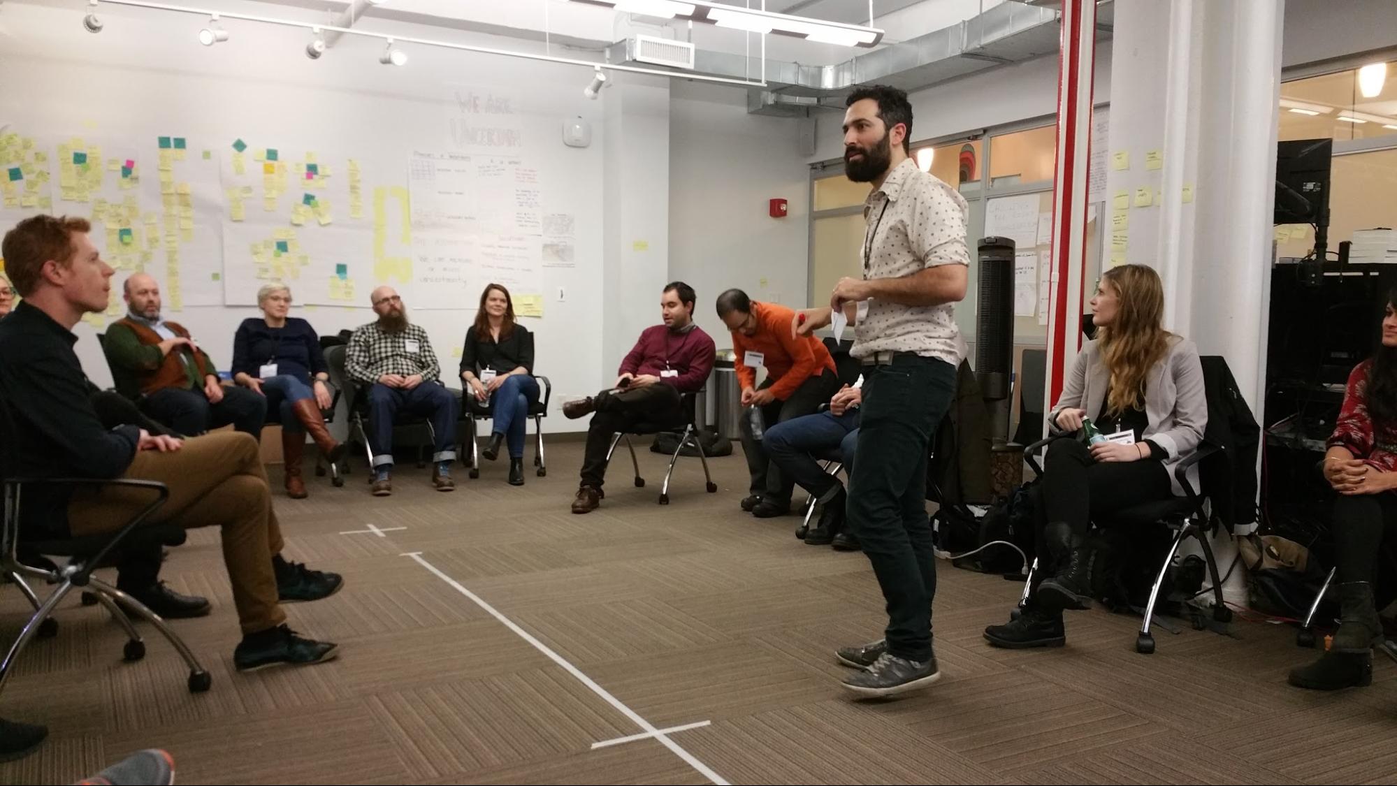
To get the blood pumping and get brains into gear, the first session was a warm-up exercise. Participants wrote 'polarizing ideas' onto post-its, and then each was read out in turn. We stood at different locations along a -/+ axis marked on the floor to illustrate our collective agreement or disagreement. Outliers were asked to justify their positions, to encourage others towards them.
After this one-off 'gelling' exercise, the rest of the day was focused on producing the outcomes.
Mapping key concerns
To begin this main phase, facilitators asked the group to think of a blog post title they might write in the following 12 months. Participants wrote many answers each on different post-its, and these ended up plastered across the wall.
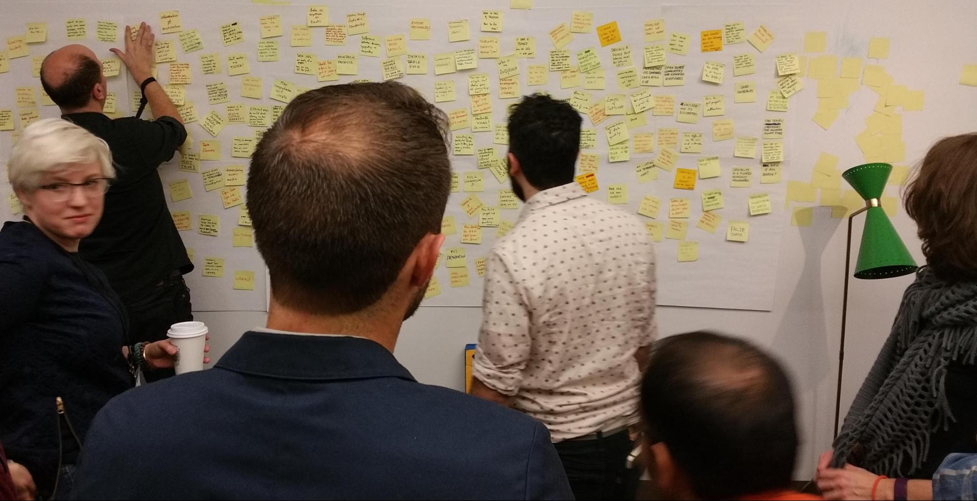
Participants enthusiastically organised these post-its into clusters, and named each cluster for the theme it represented. There were more clusters than I expected. The clusters identified were:
- Perspective
- Literacy
- Uncertainty / missing data
- Non-screen visualization
- Risk
- Culture / participation
- Responsibility
- Motivation
- The future
- Transparency / honesty
- Simplicity
- Audience
- Openness
- Methodology
- Theory
- Power
- Tools
- Bad data viz
Note that the organisers published a wiki specifically for this seminar - you can find records of all the post-its there. We then moved onto the next session.
Subject-focused teams
Next, these clusters became themes, topics for exploration. We then needed a shortlist of clusters which it made sense to work on that day. To create this shortlist, clusters were marked for their importance to participants, but also for two other considerations:
- Is this a theme which is already being effectively addressed by others in the field?
- Is this a theme which we have the time & resources to tackle today?
This gave us a shortlist of concerns available to tackle. We formed teams to work on these topics by volunteering. We made adjustments if a team was too small or too large.
We ended up with the following working teams:
- Culture and participation
- Literacy
- Risk
- Transparency
- Uncertainty
- Goals
I was on the 'culture and participation' team. From here it was largely up to us to decide, within the remaining hours of the day, what to contribute to the field.
Culture and participation
I was on the culture and participation team. Our initial discussions went from pillar to post. We were unable to settle at first because as five white men and women at a dataviz conference, we were all fully participating members of this specific culture. Data scientists, technology experts and artists.
However we were surrounded by people who thought about these issues. For example my teammate Catherine D'Ignazio recently wrote about how feminist theory maps to dataviz, referencing ideas like exclusion from 'general knowledge'.
Our team coalesced around exclusion and inclusion and attempted to critique the field in terms of the ways it systematically excludes. As in the categories under which we might recognize this exclusion, and case studies of each in practice. I really felt like I was along for the ride at this point but tried to contribute by asking questions and helping to flesh out thinking.
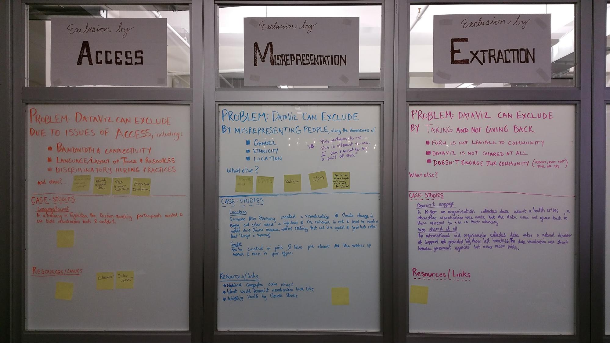
Our prototype was effectively a set of categorized content for a website. We decided that due to the lack of general inclusivity in our team, that the site would be a wiki. The definition and categorization of inclusion/exclusion that we posed would all be up for grabs. It could be refined, extended, or criticized and torn down by participants.
As was the theme of the day, these prototypes are for consideration and debate within the community. We'll have to see where this goes. If it does go up, I think the burden would be on us to make it useful by making sure that those who see and contribute to the wiki represent a broad and varied set of backgrounds, interests and perspectives.
Achieving your goals
Heading around the room, we had the chance to explore and critique each of the other teams thinking. I took some snaps and got the essence of the ideas in the room.
The goals team created a decision tree. This was aimed at helping potential visualizers focus on activities which serve the ultimate goals behind the project.
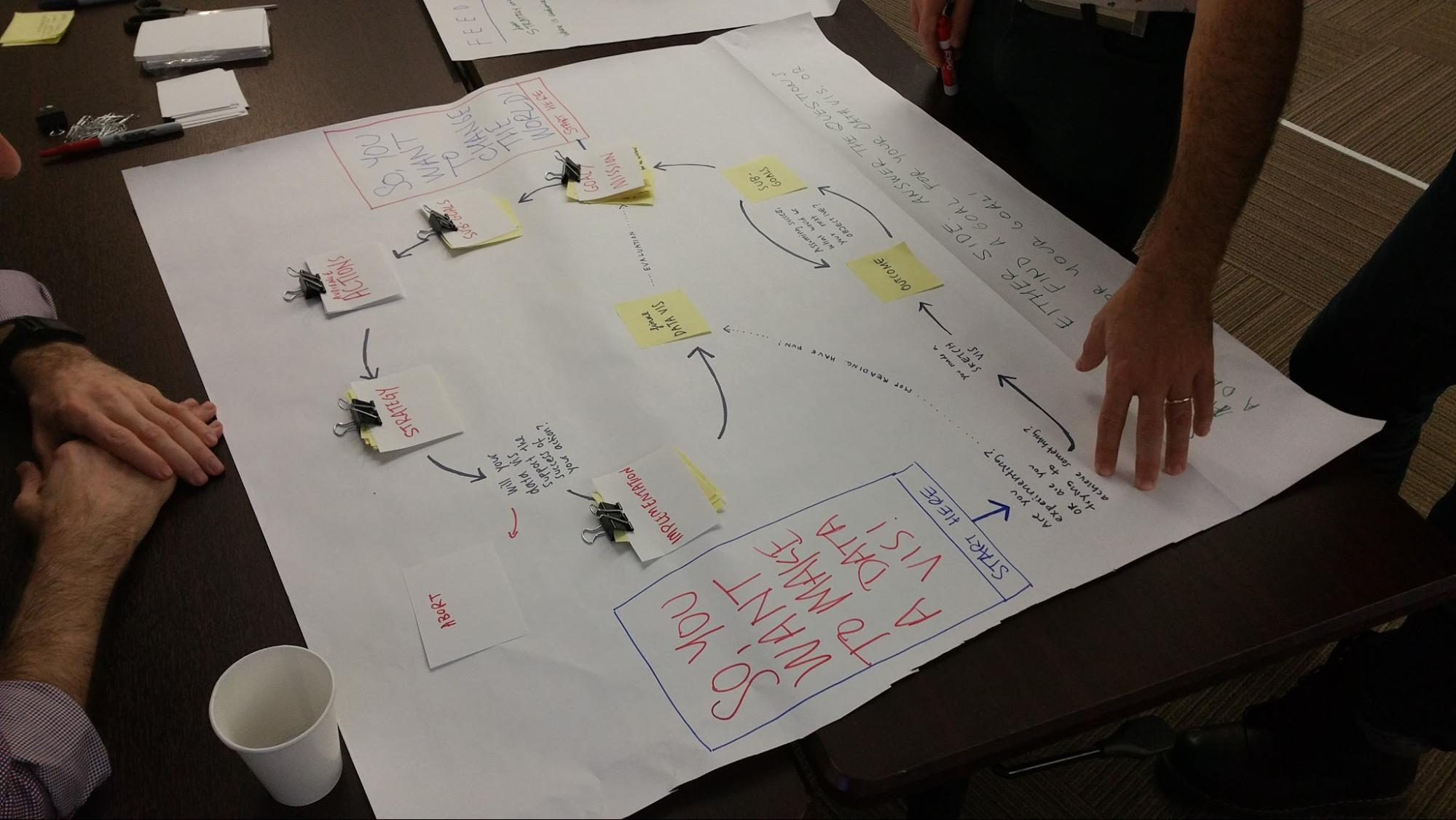
There were two entry points to the tree depending on where the impulse to visualize is coming from. In a sense, it's trying to illustrate that it is fine to come at it from either angle. It suggests that knowing your initial impulse along with your goals will help you choose a specific path.
Uncertainty in data
The uncertainty team focused on how to deal with what you don't know. In fact, I imagine that absolute certainty is unachievable, it's all a matter of degree. The charts this produced prompted questions of practitioners on how to assess their level of uncertainty.
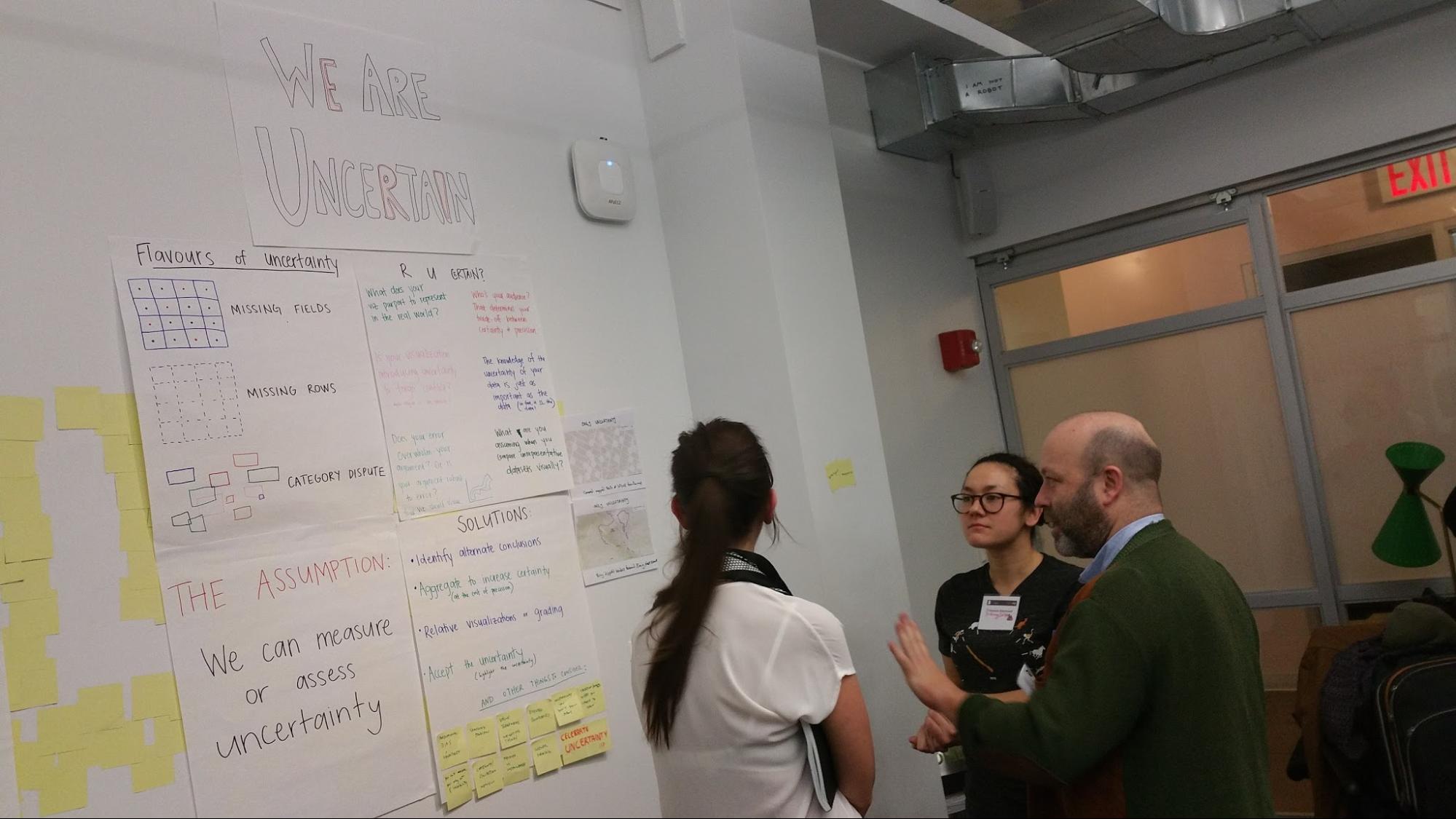
Questions like "at what point does your error overwhelm your argument?" or "who is your audience?" were on display. I suspect the reason for the latter is that there is an embedded incentive to pander to the prejudices of your audience on some subjects, while purporting to confront them on others.
The lower half of the charts dealt with solutions. One example is to aggregate to increase certainty - the trade-off here is that you lower precision in the process. One of the contributed answers in thick red marker at the bottom is 'celebrate uncertainty'.
Data literacy
The data literacy team produced an array of thought pieces. Near the top, they are asking critical questions - "how do we improve dataviz design", "how do we teach literacy", and "literacy in which aspect? (data, tools, methods, design practices?)"
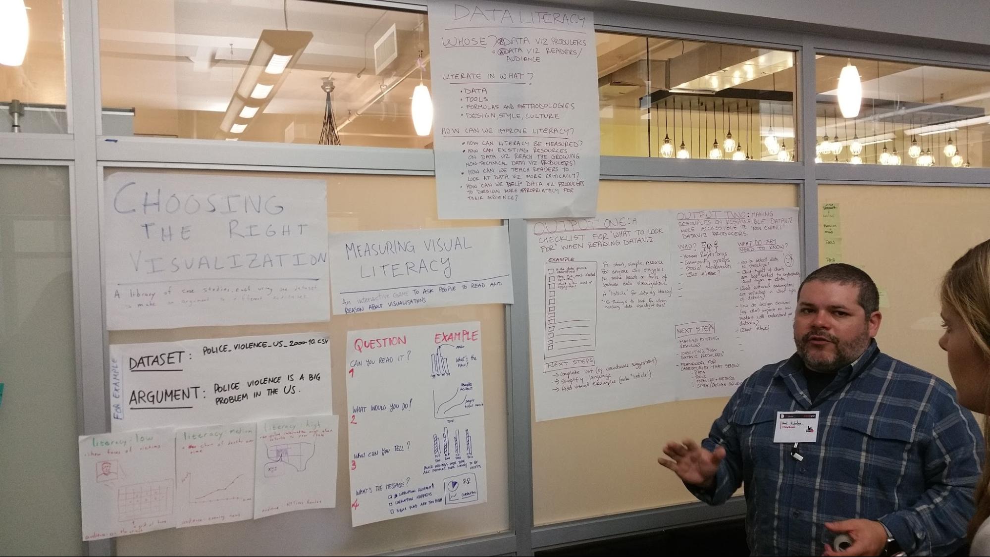
Under this are examples of ways you can measure literacy, which actually also double up as ways you can critique a visualizations audience-fit.
Finally, the team produced a pair of further outputs. One is a checklist to help readers look at common dataviz more critically. The other is a tool designed to help practitioners speak to a 'non-expert' audience with their visualizations.
How transparent are you?
The transparency team created tools to facilitate discussions on the extent you might make different parts of your process open for public consideration.
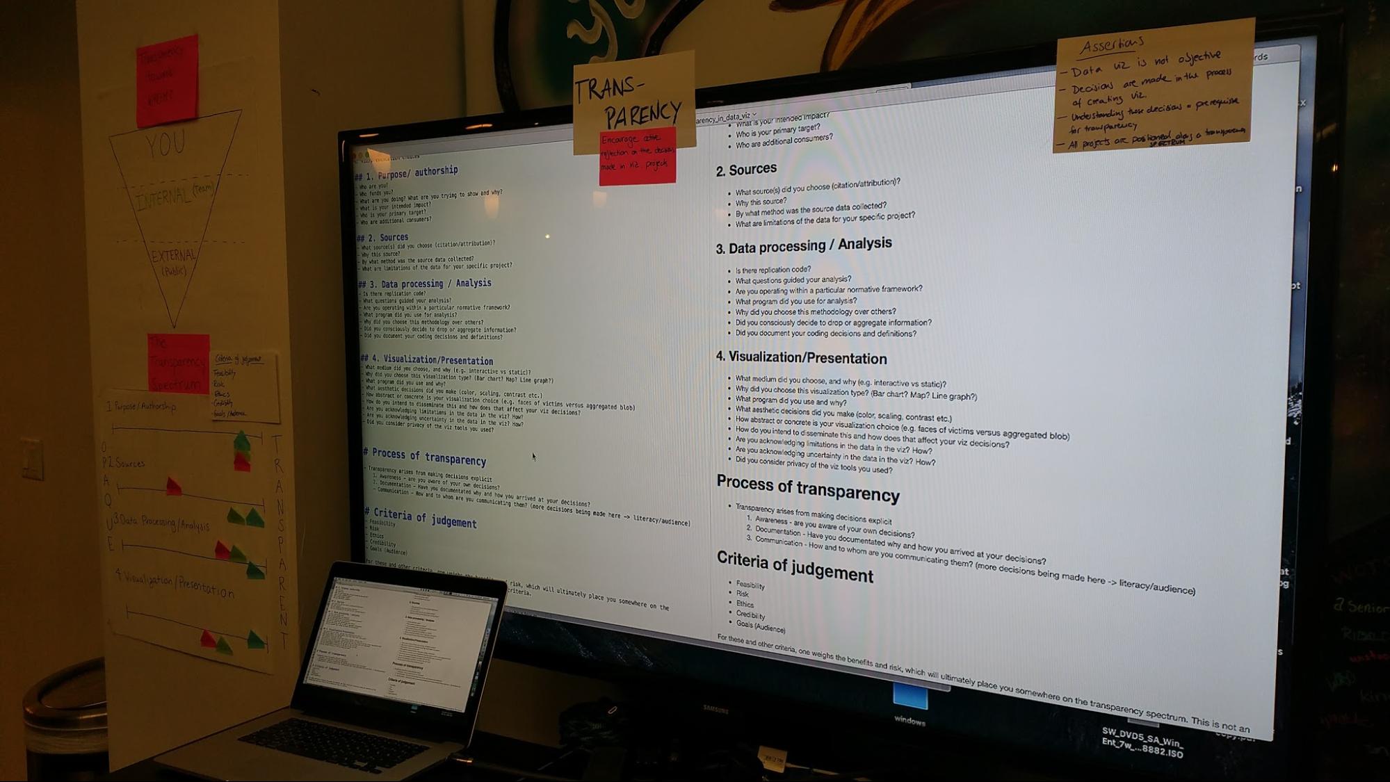
These tools acknowledge the reality that transparency isn't some kind of general good, with 'more transparent' simply being 'better'. For example, a private enterprise might wish to protect trade secrets, or a non-profit might be trying to protect people's identities (or vice versa!)
Either way, a decision process needs to be undertaken, and the route you take is very similar to that of considerations of data security.
A game about risk
The risk team created a participatory educational tool in the form of a game. The game is played by making a sequence of decisions about which cards to draw, each of which takes the player further on a journey of dataviz production.
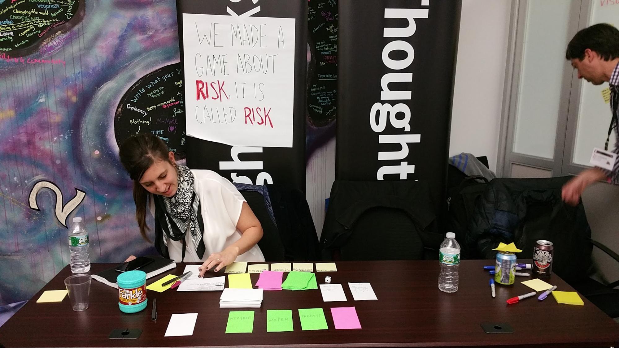
Along the way, players are exposed to risks, helping them learn in a safe environment the types of pitfalls they never hope to encounter in reality.
Concluding the session
This was an incredibly well-facilitated session give the number of experts in the room. A number of conventions were used to make sure that people communicated effectively, such as a series of physical signals to offer common responses without raising your voice. In fact, applause was indicated by hand-waving in order to minimize disruption from the large crowd.
On the flip side, one of the participant's comments during the wrap-up retrospective stuck with me. He said that many of the topics in the room already had precedent, and in future sessions it might be better to seed the activities with knowledge-sharing of precedents, to avoid re-treading ground.
I suspect that criticism is valid, though as a newcomer to the field I can't place much emphasis on that. The group seemed to agree, and I found them more than willing to be self-critical. Criticism and reflection is the first step in improvement, you might say.
Another comment that resonated with the group was one we had already discussed in our inclusion team - the lack of general racial and ethnic diversity in the room. The gender ratio was about fifty fifty, but the faces were predominantly white American and European.
As a newcomer to the field, the ground-retreading wasn't a problem for me - in fact if anything it made the material more accessible. The intent, friendliness and attempted effectiveness of the group made them a fun and interesting bunch to work with.
All in all this was a great way to explore a new topic - in a participatory fashion rather than from a book. It was an enlightening and engaging experience, and I'm interested to see where these various trajectories head from here.